Word processors are great tools but can be frustrating to those who don't know how to use them efficiently. I have a list of 10 things I think everyone should know about word processing. Do you know all 10?
- Use the Enter key ONLY after at the end of a paragraph or when you need a blank line.
- Word processors automatically wrap text so there is no need to press enter at the end of the line.
- There is a line spacing function in word processors that can be used to double space a paper.
- Use the Space Bar Correctly.
- Use only one space between words.
- There is no space between a word and the puctuation that follows.
- Use one space after all punctuation marks.
- Use the Tab key to indent for paragraphs.
- Save Your Work Frequently!

- Save every 5-7 minutes. You never know when a computer can freeze or crash.
- Spell check all your work.
- This won't catch the use of a wrong word but it will catch spelling errors.
- Spelling errors make the user appear lazy.
- There is a "Best Font" for your work.
- Arial, Tahoma, Georgia are very readable fonts (there are many more.) Save the fun, crazy fonts for the fun, crazy documents you make for your friends.
- Don't use the Caps Lock key to capitalize one letter.
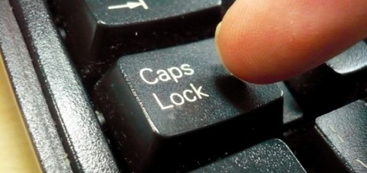
- USE THE CAPS LOCK KEY WHEN YOU HAVE SOMETHING IMPORTANT TO SAY!
- Writing in all caps indicates you are yelling. Don't give your audience the wrong impression.
- Use the correct text alignment. Left align is what should be used almost all the time.
- Left alignment with ragged right edges is the most commonly used. It should always be used for the body of your paper.
- Center alignment is used for poetry, announcements, invitations, and short sections of text.
- Right alignment creates a special effect. Remember that right alignment means the text is tight against the right margin.
- Justified text will cover the width of a page, but it will also change spacing in order to do that. It often cuts down on the number of words that will fit on a line and sometimes makes large bodies of text look “darker” or crowded.
- Two fonts at most in a document.
- With rare exceptions a document should never have more than two font styles.
- Along those lines most fonts are easiest to read in sizes or 10 to 14.
- Learn to adjust the margins.
- Sometimes you want the document on one page. Adjust font size and margins to fit.
- Use Print Preview before you print. Printing should be done when your document is perfect.
No comments:
Post a Comment